Summary: Can I Park Here is a web portal designed for the City of Chicago to help drivers locate legal street parking by displaying all relevant parking restrictions to the driver. Through clarifying parking regulations for drivers, its ultimate aim is to help build trust between citizens of Chicago and the city government.
Project Provider: Designation
Design Role: UX Designer
Tools: Paper, POP/Marvel, Google Survey, Axure
Deliverable: Research, concepts, usability testing, interactive wireframes
This project was provided by DESIGNATION as a mock project. Our goal was to redesign one of the city microsites to improve the experience for citizens accessing their local government information and services. These services include city and state budget, city council meetings and minutes, election history, government services, and communications with elected representatives. We had 4 weeks to produce a deliverable wireframe prototype.
We started by looking at the City of Chicago website. We spent some time to try to pick parts of the site or portals that need to be improved.

From initial glance, the site looked outdated with a sense of cognitive overload. The major problem was that the city website struggled with poor information architecture (IA); it used a complicated system of nesting to deal with the enormous amount of information and services it provides.
With that in mind, we looked at other city/government web pages that were considered “good designs”. We found an article about award winning government/municipal sites. We followed up on it to see what kind of elements that the CoC website should incorporate to turn it into a “good design”.
We extracted these insights from the article
From this list, it seemed to affirm that we were dealing with a combined UI and IA issue. But from the original prompt, UI and IA certainly was too shallow of an issue to address. So we dug deeper.
Because the city site is designed to be a central hub of services that dealt with everything from informing visitors about various city government officials to helping visitors deal with traffic tickets, it was initially overwhelming for us to nail down exactly the parts the site that needed to be improved.

From the list of insights we came up with, offering digital services is crucial to .gov site success seemed to echo with the project prompt. We turned our focus onto the digital services the CoC website conducts with its citizens and found the city 311 services page.
This was a narrower space to focus on. But we still had doubts; on the left menu, there was an additional list of services provided by the city, not 311. These city services include paying for traffic violation tickets and applying for jobs. We also needed to see what city services visitors frequent this website for and the specific services that people use, and if so, how is the experience? Using this as an anchor, we conducted further research and interviews.
We began by researching online just to see what visitors of most .gov pages generally look to do, hoping to find a statistic that we could use to compare and contrast with what we had.
What we found was the result of a study published by Vision. The study lists a number of services visitors of city websites generally like to do.

This was an extremely important piece of finding in the overall scope. We used this list to frame our in-person interviews, because ultimately we wanted to find out what citizens of Chicago use the city website for. To find out, we sent out a survey for all who have dealt with the CoC website.

An overwhelming number of respondents answered paying for parking tickets. We needed to know why.
We hoped to find some insights through user interviews. We saw a strong trend of using the city website to pay for parking tickets and parking permits. We wanted to know why.
"I often receive parking tickets because I don't know all of the parking rules." -Pam
We also heard a consistent undertone of mistrust with the city government.
"Whenever money is involved, you just can't trust the government." -Jake
On our final interview, I found Dave, a retiree in his 60s. Dave considered himself to be very savvy. He believed most people get parking violations because they were not aware of the street cleaning schedules.
From our user interviews, we suspected parking was going to be a lead but we needed to tie it back to the prompt. To confirm our suspicions and to draw more connections between these insights, we took our insights to affinity mapping. We saw parking violations was indeed a huge concern, within this group there was a hint of confusing parking signs; we needed a concrete connection.
"Winter parking regulations start on Dec 1st… Signs say no parking if snow over 2 inches OR after Dec 1st - so it doesn't matter if it snows or not… 3000 cars probably got towed today." -Jenna
We corroborated her insight with an official city record of daily number of cars towed in Chicago.

All of our findings pointed to parking as a major issue. This was further substantiated by that Chicago was owed $1.5 billion in traffic tickets, of these $1.3 billion was from parking violations, to put that in context, New York City was owed half that amount. We needed to justify why the city would be interested in a solution that helps drivers avoid parking tickets.
According to the article, the city was not getting those tickets paid, and was accumulating that debt. Additionally, from an insight provided by Dave, it seemed that drivers were unwilling to pay off these tickets because they felt unjustly punished.
"I don't mind paying up if I know I was in the wrong." -Dave
We looked at the competitive landscape for parking in Chicago to see which area our product could focus on.

Most of the competitors in the Chicago parking space were private entities such as SpotHero and ParkWhiz, they were built to help people reserve private parking spaces. A few public services such as the 44th Ward and TktTxt served to warn drivers of road closures and updates through texts. ParkChicago and MeterBeaters mainly dealt with metered parking. None of these services involved parking regulations, and most of them were private entities that didn’t supply easily obtainable information.

To help give some perspective to these insights, we created two personas that illustrates the two opposite types of users: long term parking vs short term parking.

These two personas were developed to be in conflict with each other; Matteo is an event goer looking to park in a residential street for free, while Naomi is a resident fed up with event goers taking up her street.
Through these two personas, we developed a problem that best framed the issue:
Chicago drivers need a way to access location specific street parking rules in real time, because ambiguous and inconsistent parking rules result in frequent parking violations. This ultimately results in feelings of mistrust towards the city government.
Additionally, we came up with a list of design principles that our concept should revolve around. We felt that since this is an official product managed by government, the overall idea should still remain bureaucratic.
Communicate simply and clearly to guide users through the myriad of rules of and regulations
Design and voice used should feel like they come from an official, credible source
Compress complicated and layered rules and regulations into concise and digestible chunks
The overall design direction was to maximize simplicity by flattening the layers of parking rules and regulations, to empower users when it came to parking their own vehicles, and to show the user that parking rules and regulations had been clearly communicated should they ever receive a parking violation.
We brainstormed a number of approaches to our problem at hand.
With these concepts in place, we named our product Can I Park Here (CIPH). Keeping in mind that we were developing a microsite, an extension from the CoC main site, we wanted to keep it as brief and straightforward as possible.

To see if these approaches would work for our users, we came up with three divergent paper concepts. Both of my teammates focused on the block parking schedule idea (Concepts A and B), while I explored a different route. I wanted to show more granular details about how different sides of the street would have different parking rules, as there are things like fire hydrants and driveways that are no parking zones (Concept C).
We then went to test these concepts, and found that testers did not respond to:
Features that our testers did like included:
We were also able to affirm with testers that parking in Chicago was a huge headache; they all found our concepts potentially helpful.
With these findings we decided to ditch the street overlay concept and focus on testing variations of the parking schedule concept. Additionally, we wanted to include a mapping and guidance system that would help guide the user to a legal street. This was a design decision we made early on because we wanted to help the user find a place in case they couldn’t park on the street that they were on.
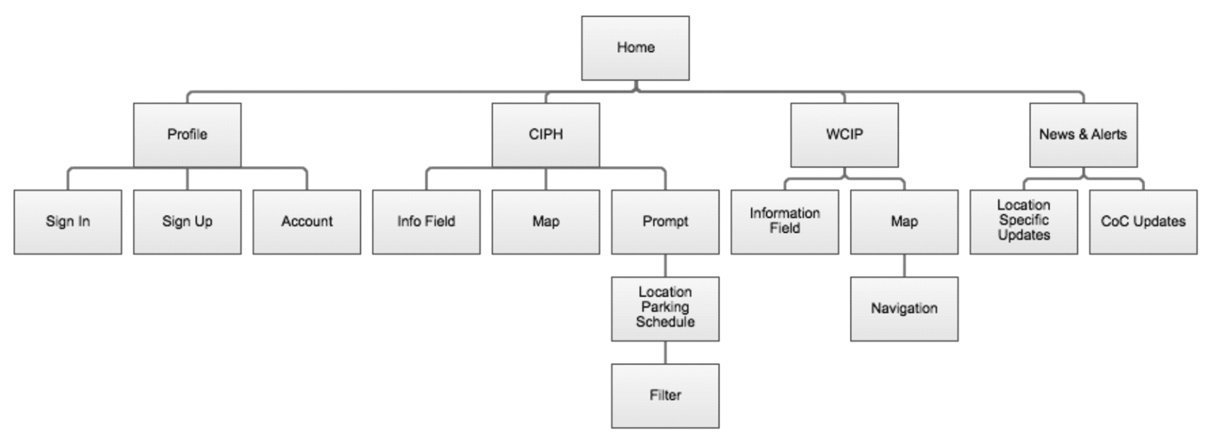
At the time we weren’t sure how the two concepts of confirming whether they can park or not and finding where they can park be married together. So we decided to make a single moiety combining two distinct functions: Where Can I Park (WCIP) was the task flow that guides the user to a legal location. Additionally, we attempted to integrate CIPH into WCIP, in that once a user is navigated to a specific place, they can call on the CIPH feature to see if they can indeed park. Combining these two flows along with user profile and news and alerts features, we developed this site map that will help guide us in the next concept.
Based on this map, we redesigned our paper concept with 2 task flows for CIPH and 1 for WCIP. We each individually designed one of these task flows, I designed CIPH A flow. There were still a lot of questions surrounding the parking schedule concept; while we saw that it was a very effective method, we wanted to know the time span users were comfortable with seeing: how much is too much? How much is not enough?

The main difference between CIPH A and CIPH B were the block parking schedules; CIPH A featured a 24-hour schedule, while CIPH B featured a 7- day schedule.

We integrated the WCIP flow with the CIPH flow so users could navigate to a legal street after they were told not to park via the CIPH flow or they simply couldn't find a spot. We wanted a way to help those new to an area to find a street they were allowed to park on. Ultimately we felt this concept was complicating the overall flow.
We put our 3 concepts into Marvel (formerly POP) to make them clickable and tested them with 4 testers.
"I like the 7 day schedule, it is easier to digest than the hour by hour schedule shown on the map.” -Marcel
Testers largely preferred the parking schedule on concept B, they felt more comfortable seeing more than just 24 hours. However, they did like the big “You” marker on concept A. As for the A vs B concepts on whether or not the map is preferred, we found that testers liked the idea of having a map that shows where on the streets they can park.
“I want this to be more like Uber.” -Hassan
In terms of the WCIP concept, the biggest takeaway we got was that testers wanted an Uber-styled interactive map. Overall, they were not attracted to the guidance system.
We took our paper prototypes to Axure for wireframing and added interactions. And since WCIP was not very well received, we minimized and incorporate it into CIPH. From what we had seen, the MVP should focus on simplifying and laying out the myriad of complex parking regulations for our users; everything else should be considered luxuries. Additionally, things like navigation and system notifications could be better accomplished by integrating with more robust products like Google Maps and Google Calendar.

Having gathered findings from previous tests, we decided to make the map the very first screen. As for the parking schedule, we settled on the concept of using a 7-day schedule with a marker indicating the current hour. We also decided to design an Uber-styled map interaction in that an indicator would pop up as soon as the map pin landed on a legal street. This greatly simplified the entire flow and allowed users to do multiple things on one screen.
With the top level concept settled, we focused on more granular details that we want to test. We wanted to know if our new map interactions are immediately intuitive. We also wanted to test how the popup message after pin drop should be displayed, would the user prefer the message be hidden, or would they want to see the message to be more prominent? What about the set parking time widget, how could we smoothly integrate that into the overall design?
We looked at how SpotHero designed their parking meter widget and thought it was a good concept to integrate
We made 3 interactive prototypes. The first two were focused on how the popup message was displayed. Version A shows full messages and warnings as an overlay, while version B hides messages and warnings in a minimized menu, and the user has to click on that menu to open it. Both versions used a SpotHero-styled parking meter widget.

When users set their parking time via the SpotHero widget, a vertical dial opens.

For my version of the prototype, I spent a lot of time working out the drag and drop map interaction. I tried to make the interaction a little more convincing by making the marker in the shape of an actual parking meter. I steered away from the SpotHero widget because I wanted to keep as much of the map free from clutter, and that search bar is already taking up a lot of real estate. Since I made the marker bigger and more prominent, I decided to go with the minimized alerts design.
As for the setting the parking time, a peer suggested that she would want to see all the restrictions and alerts as she sets her parking time, so she wouldn’t have to go through the process just to find out she couldn’t park within certain times.

I prototyped a draggable meter. The idea is inspired by the set sleep/wait time widget from the popular franchise RPG Elder Scrolls series.

Since I had to deal with a vertical screen as well as contents around the dragging bar, I decided to go with a vertical design.
With our prototypes, we went out once more to see what testers think. We planned that after this phase, we would converge on a single prototype.
“Just tell me if I can legally park or not. Yes or No.” -Robert
Gathering from the insights of 5 testers, several things were immediately clear:
With these insights we converted on a singular prototype. While my teammates worked to redesign the buttons and icon, I worked to prototype the overall interactions. At the beginning of week 4, we produced a workable wireframe that was thoroughly tested.
We changed the set time widget into a far more straightforward format, and we also added a 24-hour tab on the schedule so users can switch between both views. This final prototype is actually a far more simpler and stripped down version than what we envisioned in the beginning.
While this final prototype represents the culmination of 4 weeks of this project, we had 4 recommendations for future implementations:
These recommendations all come from the original concepts we proposed, and would provide a more holistic experience than the current MVP.
The final outcome of this project was extremely positive. Even though from the start, our initial proposal to focus on improving parking was met with some hesitation and push back, because the idea of improving parking to help drive better citizen relationship with the city government felt minuscule. We were able to defend our approach by showing that the parking situation in Chicago was very much a microcosm of a bigger and broader issue.
Additionally, our project was considered the most successful of the 3 projects that came out of this prompt. As a result, our work was chosen as the prompt for the incoming UI teams. We were very happy to see some of the UI projects that came out of our product.
To go forward into client projects, the most important thing I learned was to collaborate and work as a team. Because I had to face my teammates for over 12 hours a day, communication was extremely crucial. I learned that taking the initiative to speak out and communicate with my team dramatically improved our team dynamics as well as the overall morale.
I also picked up a good deal of technical skills, especially with Axure. I learned to make full use of my resources and to really push the boundaries when it came to approaching difficult problems. When I first thought about attempting to prototype a draggable map, it was incredibly daunting. But as I broke down the problem piece by piece, I was able to put together something that really surprised me in the end, and that feeling is extremely rewarding and fulfilling.